
Our Customer
Maranics is a Swedish company founded in 2017 in Gothenburg. The company provides innovative digital services to simplify the processes of document circulation for maritime, logistic, healthcare and other businesses.
The Task at Hand
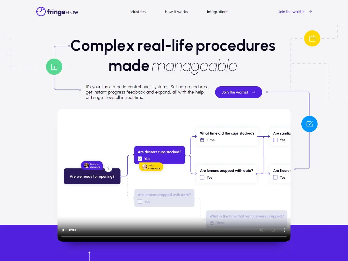
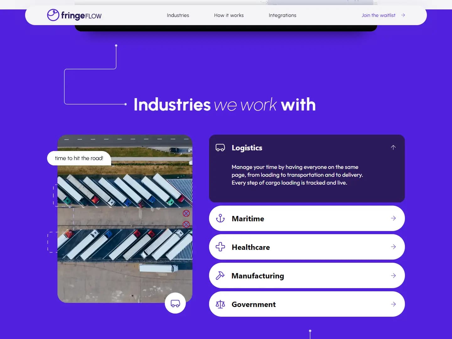
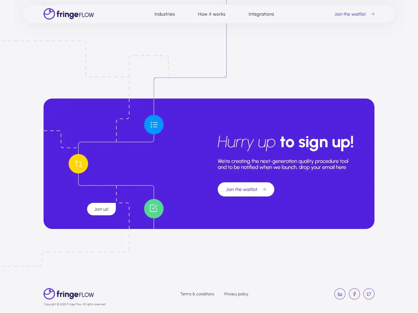
As Maranics grew and expanded its activities, the company decided to update the current website. The new site had to become not only more modern and dynamic, but it also had to provide users information about the company's field of expertise, simplify the cooperation process and give users an opportunity to leave a straight request for cooperation.
The main goal was to develop an adaptive motion-design for the company's own product, based on a ready-made design in Figma.
Company Decision
The development process was conducted according to Agile within the Scrum framework, which included successive iterations and regular demo meetings with the client.
We used a component approach in building pages using Next.js.
Using TypeScript during the implementation of the project will allow it to be scaled, if such need arises in the future.
Design required complex animation, which was realized using SVG and creating software animations. The animation is adapted for any types of desktop or mobile devices (even not powerful ones).
We also optimized the performance of the website: set the order of loading blocks and the priority of loading resources, due to which the loading speed of the entire site was measured and corresponds to the high scores of the analyzer from Google, despite the large number of videos and animations presence.
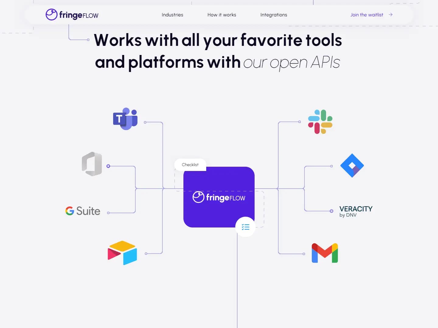
We added SEO optimization, so the site will have a higher searching rate in Google. Also added external social links.
The website is adaptive for any type of device: mobile, tablet or desktop.
The project realization took us three weeks. One more week was needed to work on customer's feedback.
The team included two developers and a QA specialist.
Technologies Used
Next.js based on React and SSR rendering for SEO optimization.